Loading...

How to Use Margin-Inline and Margin-Block for Maximum Efficiency?

Introduction

In web design, getting the spacing and alignment right is important for creating attractive and functional layouts. Margin-inline and margin-block are two useful CSS properties that help with this.

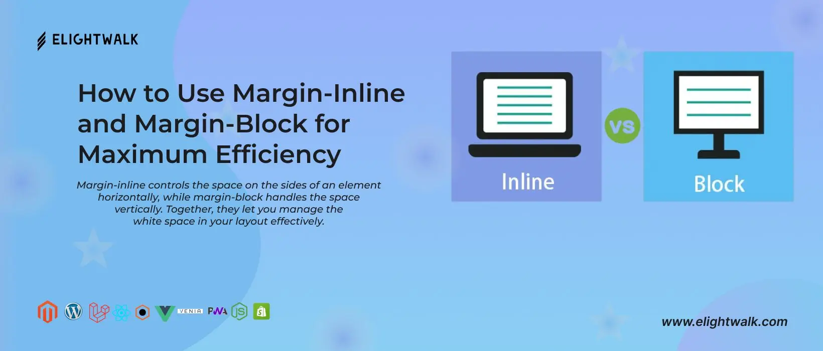
Margin-inline controls the space on the sides of an element horizontally, while margin-block handles the space vertically. Together, they let you manage the white space in your layout effectively.

To use margin-inline, just set the desired value for the left and right margins of an element. This is handy for inline or inline-block elements, ensuring consistent horizontal spacing. The Margin-Inline CSS is a shorthand property that defines an element's logical inline start and end margins, which map to physical margins depending on the element's writing mode, directionality, and text orientation.

/* <length> values */

margin-inline: 5px 10px;  /* An absolute length */
margin-inline: 1em 2em;    /* relative to the text size */
margin-inline: 5% 2%;      /* relative to the nearest block container's width */
margin-inline: 10px;       /* sets both start and end values */

/* Keyword values */
margin-inline: auto;

/* Global values */
margin-inline: inherit;
margin-inline: initial;
margin-inline: unset;

This property describes the properties of the top and bottom margins, or margin-right and margin-left, depending on the values defined for writing mode, direction, and text decoration.

The margin-inline-start property takes the same values as the margin-left property. The margin-inline-end property takes the same values as the margin-right property. The margin-block-start property takes the same values as the margin-top property. The margin-block-end property takes the same values as the margin-bottom property.

css

.elightwalk {
        background-color: purple;
        writing-mode: vertical-rl;
        margin-inline-end: 20px;
}

When using margin-inline and margin-block, it's important to consider the box model and how elements flow in your design. Planning and experimenting are key to achieving the best results.

Margin-block, on the other hand, is great for adjusting the vertical space between block-level elements. By changing the top and bottom margins, you can achieve the right amount of white space for a well-structured and visually pleasing layout.

Frequently Asked Questions:

1. Increase the Quality of Your Web Design!

Are you looking to optimize your website's layout and create a visually appealing user experience? Look no further! Discover how to harness the power of Margin-Inline and Margin-Block CSS properties for maximum efficiency.


Contact us:+91 8128405131

Email send us at hello@elightwalk.com

Ravi Baghel
Frontend Developer

A professional frontend developer with 5 years of experience who excels in tackling complex challenges. Their expertise focuses on creating SEO- and mobile-friendly products that fit customer needs. He works closely with fellow front-end engineers, helping to adopt best practices and stay abreast of new technologies.

Most Visited Blog

Blog
The Essential Guide to Animating SVGs with CSS

Unleash SVG's creative potential! Dive into our essential guide on animating SVGs with CSS and learn how to create dynamic and engaging visual elements for your web projects.

Read More
Blog
How to get the show anchor tag title on mouseover in css3.

Elevate user experience with CSS3! Learn how to showcase anchor tag titles on markup, adding a dynamic touch to your website. Explore our quick guide for seamless implementation.

Read More
Blog
How to add order list numbers without "ol" and "ul" elements by CSS for all browsers?

Optimise your order list without utilising 'ol' and 'ul' elements! Discover CSS strategies for adding list numbers across all browsers, ensuring that ordered content is presented and visually appealingly.

Read More